For version V8 & V7 only.
For version 10 or above visit - Basekit Go Sitebuilder
--------------------------------------------------------------------------------------------------------------
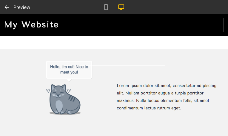
In this tutorial you will learn how to create tooltips that display after hovering over one image.

NOTE: This is an advanced tutorial that includes code. We have made this tutorial to show you it's easy to make interactive sites if you know how to code. We cannot teach you how to code and we cannot help you with questions about coding. This is for advanced users only.
EXAMPLE

Use an embed widget
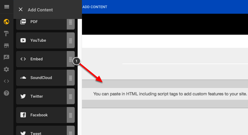
To create an image with a tooltip you will have to drag an Embed widget onto your page (1).

Paste the following HTML inside of your Embed widget:
---
<ul class="wrapper">
<li><a class="cat" href="#"><span>Hello, I'm cat! Nice to meet you!</span></a></li>
</ul>
---
In the piece of HTML above you can change the blue text to whatever you want to appear on your tooltip.
Head scripts
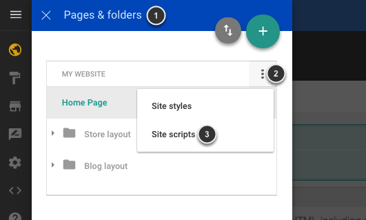
To add the CSS you will need to click on Pages and folders (1), then the settings icon (2) and finally select Site scripts (3) on the drop down menu.

Paste the following CSS onto the Head scripts:
---
<style>
.wrapper
{
padding: 0;
width: 100%;
height: 128px;
margin: 0px auto 0px auto;
list-style: none;
}
.wrapper li a
{
display: block;
width: 128px;
height: 128px;
margin: 0 2px;
outline: none;
background: transparent url('http://d2f0ora2gkri0g.cloudfront.net/live297715_cat.png') no-repeat top left;
position: absolute;
left: 35%;
right: 35%;
}
.wrapper li .cat
{
background-position: -0px 0px; /*This icon starts from 0px*/
}
.wrapper li a span /*The span will work as our tooltip and we will “hide” it by setting its initial opacity to 0*/
{
width: 170px;
height: auto;
line-height: 20px;
padding: 10px;
left: 50%;
margin-left: -64px;
font-family: Arial, Helvetica, sans-serif;
font-weight: 400;
font-style: normal;
font-size: 15px;
color: #3d5470; /*The colour of the text*/
text-shadow: 1px 1px 1px rgba(0, 0, 0, 0.1);
text-align: center;
border: 4px solid #fff;
background: rgba(255,255,255,0.5);
text-indent: 0px;
border-radius: 5px;
position: absolute;
pointer-events: none;
bottom: 160px;
opacity: 0;
box-shadow: 1px 1px 2px rgba(0,0,0,0.1);
transition: all 0.3s ease-in-out;
}
.wrapper li a span:before, /*This sets the style of the tooltip*/
.wrapper li a span:after
{
content: '';
position: absolute;
bottom: -15px;
left: 50%;
margin-left: -9px;
width: 0;
height: 0;
border-left: 10px solid transparent;
border-right: 10px solid transparent;
border-top: 10px solid rgba(0,0,0,0.1);
}
.wrapper li a span:after /*The :after pseudo-element will be placed a pixel away and we’ll make it white, just like the border of the tooltip itself*/
{
bottom: -14px;
margin-left: -10px;
border-top: 10px solid #fff;
}
.wrapper li a:hover span /*So, on hover, we will make the span move from the top and fade in*/
{
opacity: 0.9;
bottom: 140px;
}
</style>
---
The blue text is the image URL. You will need to change the URL for your own. On this example the image measures 128px on each side, so you will have to change the values accordingly.
Go to Preview
Go to the preview mode and hover over the image to see it working.


Comments
0 comments
Article is closed for comments.